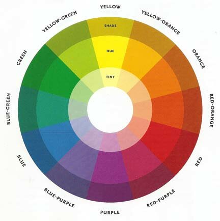
Magazines need colours that compliment each other, for example the most common colours are black and white because they are easiest to read. However, other colours can compliment each other but its risky.
colours can be added to black white which can still compliment them,
for example.
- Black, White and Blue.
- Black, White and Red.
- Black, White and Yellow.
- Black, White and Green.


However black and white don't necessarily have to be used together,
for example.
- Black and Yellow.
- Red and White.
- Green and Orange.
- Yellow and Blue.
- white and Green.
- Green and Yellow.
- Orange and Black.
- Yellow and Red.
- Blue and White.


I would like to use either
- Black, White and Red.
- Black, White and Gold.
- Black and White.
Red is used to represent danger and love. However, gold is used to represent wealth, money or independence.


No comments:
Post a Comment