
Showing posts with label magazine. Show all posts
Showing posts with label magazine. Show all posts
Friday, 17 April 2015


7. Looking back at your preliminary task (the continuity editing task), what do you feel you have learnt in the progression from it to full product?
The progression from my preliminary task to my final magazine has improved largely. As I had no understanding of many of the equipment or sites that I have used. Now i am able to use these sites with a good understanding to create something that looks professional.
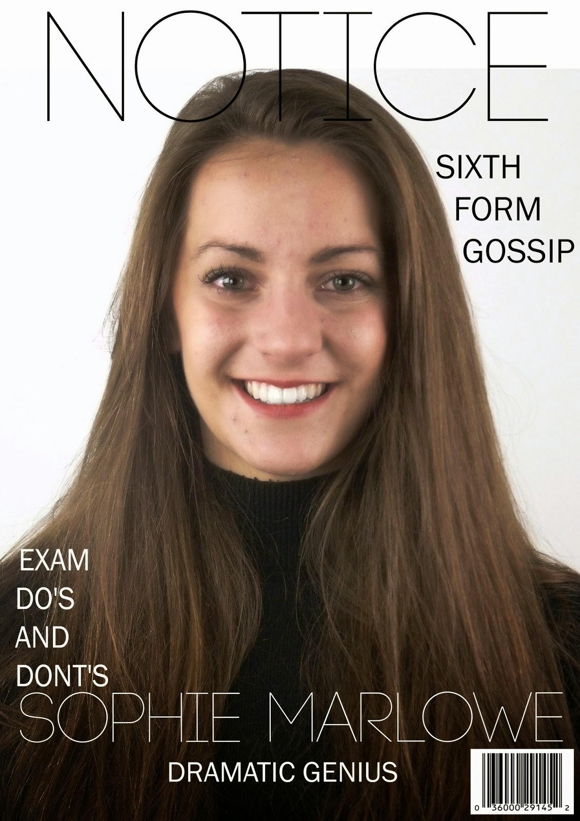 As when creating my preliminary exercise I had no knowledge of using Photoshop so it was new to me. Also i didn't really know how to place layers so my layout was basic. My main skills on Photoshop early on were adding and moving a text box or image. However the preliminary exercise helped me to get a better understanding of how Photoshop works for when improving my skills to create my final piece. Every piece that I created had its own faults, I then used these to learn from them and improve on my layouts.

As when creating my preliminary exercise I had no knowledge of using Photoshop so it was new to me. Also i didn't really know how to place layers so my layout was basic. My main skills on Photoshop early on were adding and moving a text box or image. However the preliminary exercise helped me to get a better understanding of how Photoshop works for when improving my skills to create my final piece. Every piece that I created had its own faults, I then used these to learn from them and improve on my layouts.
As i progressed with the media course I feel I have a better understanding on how to aim a magazine at a target audience and to create a pacific look for a magazine. As when I was creating the college magazine I was not thinking of who I was aiming at and i was just creating a magazine that I liked. However, as the course and my research progressed I learn't how to use different layouts to attract different audiences. Also the Name, style and content interested different groups of people so this was important. My research on UK Tribes website helped me to identify this.
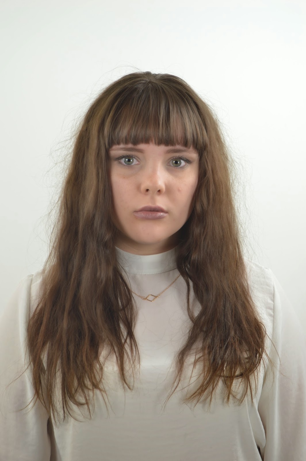
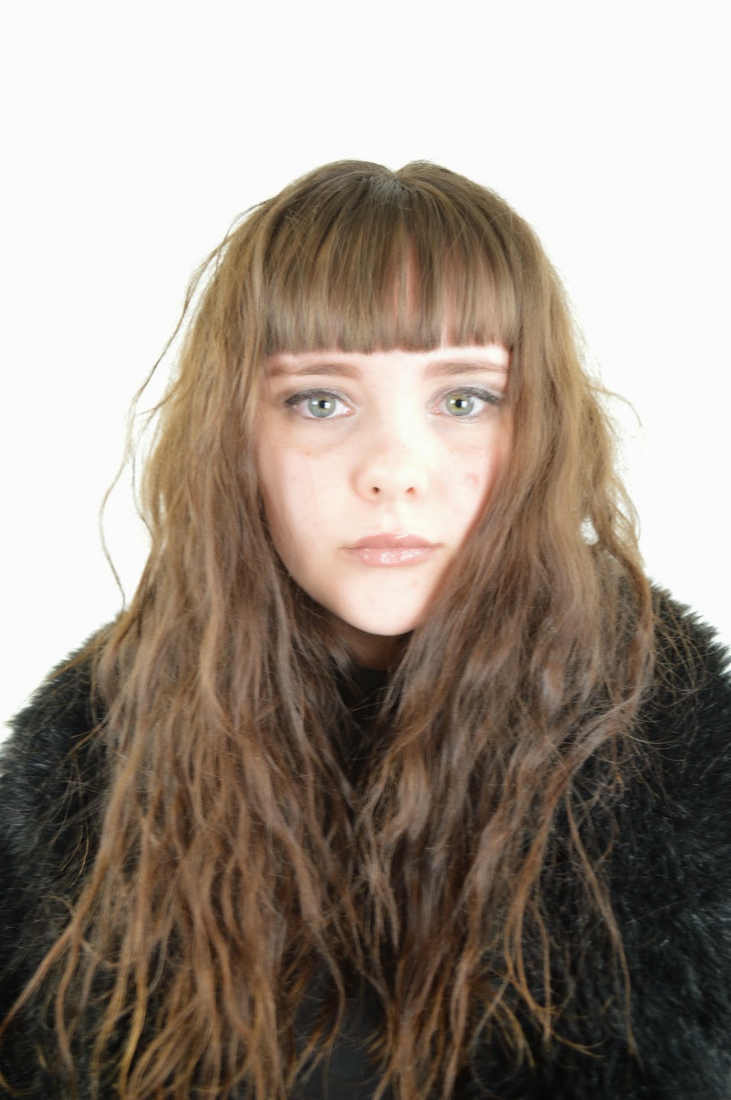
When we created the preliminary magazine I had no knowledge of how to use a professional camera. At the start i would ask another student to set it up for me or I would use it after another student I sometimes I didn't need to set it up. As the course progressed I was able to set up the camera and attach it to the tripod by myself. This process then became quicker and i was able to take more photos to capture the shot that I wanted. I also learnt how the lighting affects the quality of the image. Before I would leave the lights as they had been left. As I progressed into the coursework I discovered that the placement of the lights can make a picture darker or brighter. I moved them when taking my photos for my final magazine.
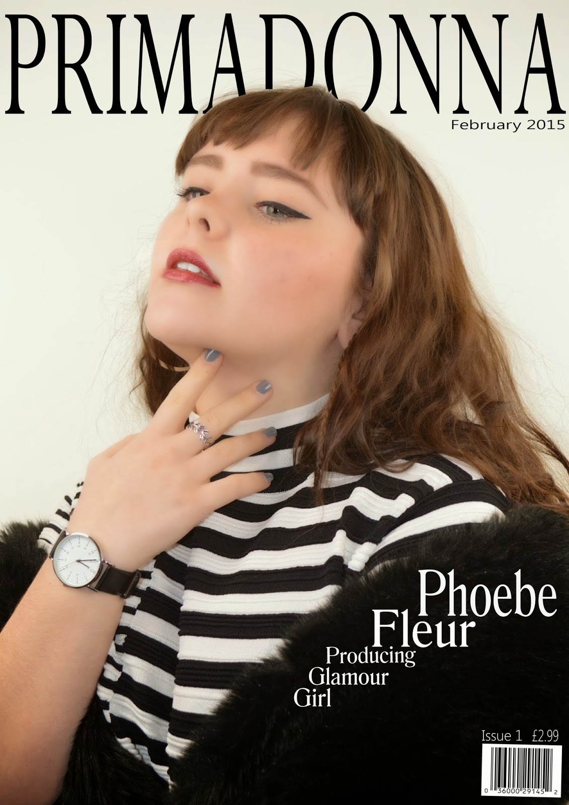 When making the draft of my final magazine I learnt basic things such as how a model should pose. I then had to change to outfit of my model as the black and white clashed with the text. Also I had to change the way my model was posing, She was previously not making eye contact with the camera looking away with her hand on her chin. I then had to change this so my artist was central and making eye contact with no arms showing. This made my magazine cover look more professional and symmetrical. From this i learn't ways to take cover photos and i began to notice how other cover photos were taken.
When making the draft of my final magazine I learnt basic things such as how a model should pose. I then had to change to outfit of my model as the black and white clashed with the text. Also I had to change the way my model was posing, She was previously not making eye contact with the camera looking away with her hand on her chin. I then had to change this so my artist was central and making eye contact with no arms showing. This made my magazine cover look more professional and symmetrical. From this i learn't ways to take cover photos and i began to notice how other cover photos were taken. 


DRAFT 7.Looking back at your preliminary task (the continuity editing task), what do you feel you have learnt in the progression from it to full product?
DRAFT
As when creating my preliminary exercise I had no knowledge of using Photoshop so it was new to me. Also i didn't really know how to place layers so my layout was basic. My main skills on Photoshop early on were adding and moving a text box or image. However the preliminary exercise helped me to get a better understanding of how Photoshop works for when improving my skills to create my final piece. Every piece that I created had its own faults, I then used these to learn from them and improve on my layouts.
As i progressed with the media course I feel I have a better understanding on how to aim a magazine at a target audience and to create a pacific look for a magazine. As when I was creating the college magazine I was not thinking of who I was aiming at and i was just creating a magazine that I liked. However, as the course and my research progressed I learn't how to use different layouts to attract different audiences. Also the Name, style and content interested different groups of people so this was important. My research on UK Tribes website helped me to identify this.
When we created the preliminary magazine I had no knowledge of how to use a professional camera. At the start i would ask another student to set it up for me or I would use it after another student I sometimes I didn't need to set it up. As the course progressed I was able to set up the camera and attach it to the tripod by myself. This process then became quicker and i was able to take more photos to capture the shot that I wanted. I also learnt how the lighting affects the quality of the image. Before I would leave the lights as they had been left. As I progressed into the coursework I discovered that the placement of the lights can make a picture darker or brighter. I moved them when taking my photos for my final magazine.
When making the draft of my final magazine I learnt basic things such as how a model should pose. I then had to change to outfit of my model as the black and white clashed with the text. Also I had to change the way my model was posing, She was previously not making eye contact with the camera looking away with her hand on her chin. I then had to change this so my artist was central and making eye contact with no arms showing. This made my magazine cover look more professional and symmetrical. From this i learn't ways to take cover photos and i began to notice how other cover photos were taken.
DRAFT 6. What have you learnt about technologies from the process of constructing this product?
DRAFT
I have experimented with a variety of technologies that were new to me when doing my coursework. I have used these and they indicate my skills within this area. As I have progressed my way across the course I have learnt how to use software i didn't know how to use before.
Computer:
Computer:
I have used a computer during the entire process. It has given me the opportunity to use other websites and programs. It has also helped me to do research which was a vital part of creating my magazine.I have used the school computer and my own laptop at home. I mainly used the school computers as my own laptop is new to me and I am not confident using new programs on it.
Adobe Photoshop:
Adobe Photoshop:
I used this software to create my magazine I had no previous experience of using Photoshop before we did the preliminary exercise. As we progressed further into the course I picked up the skills and knowledge of Photoshop and created a magazine I was proud of
Mircosoft Word:
I did not use Microsoft word much in the course. I relied on it mainly to check my spelling and word count. I would write my posts onto word before transferring them onto blogger. This was because I am familiar with word however it doesn't offer many tools.
Blogger:
I have used blogger since i started the course, I post my research and what i have learnt throughout the process. This has been useful as I have been able to go back and look at my previous work especially my development and decisions. It has also been a vital part of my presentation as it looks neat and professional.
Animoto:
I used this software early on in the magazine making process before my draft magazine pages. I used it for creating a pitch for my magazine idea, I had never used Animoto before I started the coursework, I realized it was simple and easy to use. It helped to create a stylish view of my magazine early on introducing new skills.
Camera (Nikon D3200):
This was the schools camera which I used to take my images in my magazine. At first I struggled to use it as I was new to using a good quality camera however, once I learnt how to place it onto the tripod I was able to figure out how to use it. Overall the camera gave me good quality images.
Lighting:
To take my images I used three soft lighting boxes, these created good quality lighting. However as i took my photos of my different models not at the same time, the lights were placed slightly differently each time this meant the lighting in my photos was not the same as on some the background looked grey and on others it looked white. When it came to taking my final images with my main artist I had to have two attempts, as the first set of photos came out too bright as the lights were too close.
Internet:
The internet was particularly useful when it came to research, for this I mainly used google chrome. I carried out research throughout my course work so it was very important providing me with my inspiration. The internet also provided me with the ability to use sites such as Animoto which made my planning and presentation more professional.
DRAFT 5. How did you attract/address your audience?
DRAFT

My magazines audience is Indie Scenesters and RAH's, I discovered this when researching facts on UK Tribes. This then helped me when looking at layouts for my magazine that would attract my target audience as this was vital to see which market I was working in. Learning how to address my target audience within my magazine is important as this will help me decide how I am marketing my magazine. This will determine my final product and how it will sell in the retail market. I have kept an open mind during the process of my magazine and how I would market it.
I attracted my audience in many ways. The main way I attracted them was through my front cover. I achieved this by using an image that stands out including a model who is uniquely dressed with a large hat that is eye catching. I also wanted to keep my designs simple and not cover crowded as i feel this can look messy. Also the image and magazine becomes lost underneath writing, because of this you lose your audience. My model used in my cover image is the same age as my target audience, there fore my target audience will be attracted to this. However my image is not bright therefore it will be be eye catching to the audience and as i didn't use a boarder the image could become lost.
I think my magazine is something that will have success in the media text/magazine area. I think this because I have not used a boarder as other unique magazines have, not using a boarder makes the cover stand out as there is more to look at on the page. Also my fonts and their placement are neat, they are also based on other magazine layouts that have had success such as BAZAAR. Because of this I have confidence in my magazine doing well in the high end market. Another thing that has helped create my magazine to be more appealing is the name of my magazine. I am happy with my name as it best describes the feelings of my target audience who are wanna be's. Because of the elegant name I felt my magazine needed to have an elegant layout, which then helped to give me ideas as to what my target audience would want to see in a magazine.
Thursday, 16 April 2015
DRAFT 3. What kind of media institution might distribute your media product and why?
DRAFT
Clash magazine is also published my COMAG institution. This is also a magazine that I took inspiration from when I was doing my research. Models and artists used in The Clash magazine covers were also part of my inspiration for the style of my model and music genre. On this cover of Clash magazine is FKA Twigs who was part of my music inspiration. COMAG started in 1990 so it offers many years and experience on how to reach a magazines intended audience. As COMAG knowing how to reach an audience is important to me as I would like my magazine to reach out to a younger audience was my magazine has quirkiness. I would also like my magazine to reach out to an older audience as it contains elements of sophistication and is simplistic. As COMAG has this knowledge of target audiences COMAG would place my magazine in shops and areas where it would reach my target audience.
I would like to think that COMAG would use their knowledge of publications and put this towards my magazine so its forcefulness could grow. As COMAG has established itself in the media text market it has a number of Alternative magazines, Therefore my magazine would add more variety to this category. As I am confident in the unique Quirkiness of my magazine I feel COMAG would do well to help its success.
My magazine is priced at £4.99, this is priced higher then other music magazines however I have taken inspiration from BAZAAR magazine which has a higher price. I have taken this inspiration as BAZAAR has a similar target audience so it is an indication as to what my target audience would be willing to pay. A higher price also indicates the quality of the magazine is better as the money made from magazines it put into future issues. As an addition in my magazine I will include advertisements such as up coming albums and films. My magazine would also include pages of fashion adverts that will feature brands similar to the style of my magazine, such as River Island and Ted Baker. This will also include unique vintage clothing stores as my magazine has a quirky element. These advertisements will draw in my target audience as the content includes their interests. COMAG have experience of advertisement for this style and will know the best ways to reach a particular audience, so they will be willing to take on my magazine to publish it.
An institution company that I want to publish my magazine is COMAG. Through research I found a few companies that could publish my magazine, however one particular one would be COMAG.
Clash magazine is also published my COMAG institution. This is also a magazine that I took inspiration from when I was doing my research. Models and artists used in The Clash magazine covers were also part of my inspiration for the style of my model and music genre. On this cover of Clash magazine is FKA Twigs who was part of my music inspiration. COMAG started in 1990 so it offers many years and experience on how to reach a magazines intended audience. As COMAG knowing how to reach an audience is important to me as I would like my magazine to reach out to a younger audience was my magazine has quirkiness. I would also like my magazine to reach out to an older audience as it contains elements of sophistication and is simplistic. As COMAG has this knowledge of target audiences COMAG would place my magazine in shops and areas where it would reach my target audience.
I would like to think that COMAG would use their knowledge of publications and put this towards my magazine so its forcefulness could grow. As COMAG has established itself in the media text market it has a number of Alternative magazines, Therefore my magazine would add more variety to this category. As I am confident in the unique Quirkiness of my magazine I feel COMAG would do well to help its success.
My magazine is priced at £4.99, this is priced higher then other music magazines however I have taken inspiration from BAZAAR magazine which has a higher price. I have taken this inspiration as BAZAAR has a similar target audience so it is an indication as to what my target audience would be willing to pay. A higher price also indicates the quality of the magazine is better as the money made from magazines it put into future issues. As an addition in my magazine I will include advertisements such as up coming albums and films. My magazine would also include pages of fashion adverts that will feature brands similar to the style of my magazine, such as River Island and Ted Baker. This will also include unique vintage clothing stores as my magazine has a quirky element. These advertisements will draw in my target audience as the content includes their interests. COMAG have experience of advertisement for this style and will know the best ways to reach a particular audience, so they will be willing to take on my magazine to publish it.
Saturday, 28 March 2015
DRAFT 1. In what ways does your media product use, develop or challenge forms and conventions of real media products? (i.e. of music magazines)
DRAFT
During this project i looked at different styles and model magazines during the planning and research stages. I particularly looked at BAZAAR, Esquire, W and Interview, their page layouts, colour schemes and styles most interested me. To achieve the look of the magazines that inspired me i focused on my genre, which was indie pop, and looked into the audience of my magazine. I felt my target audience should be 16 - 23 females. BAZAAR magazine was my largest inspiration as i was analysing their covers the style of images and colour schemes inspired me. Their image colour schemes and style speaks to audiences showing what type of magazine it is. I kept this in mind when taking my own photos as i wanted the look of my model to speak for itself, this was important as i wanted to use the same conventions as BAZAAR magazine. BAZAAR magazine has a sophisticated retro style, i wanted to challenge this and see if i could make create a modern sophisticated magazine in a retro style.
Also analysing Interviews covers showed they have a simplistic Look and colour scheme, however their layout is still busy with plenty of text. I used this as inspiration as I wanted a magazine that had plenty of text but the focus isn't taken away from the image. Interview achieved this with a simplistic colour scheme; of black and white being the main focus but it features touches of other colours. This inspired me to use a basic colour scheme with black and white as the main colours with touches of browns, purples and creams.
Researching more stylish colourful magazines such as W magazine gave me inspiration for the type of model I wanted to use. W magazine also uses unique cover images which makes their covers stand out. This gave me the idea to use Phoebe as my model because her facial features had a unique look, also to dress her in a way that when captured is unique and stands out.
Researching Esquire magazine gave me ideas on how to create a popular magazine cover. Their covers include text which is eye catching and straight to the point. As my target audience is 16 - 23 girls text is needed to attract them to my magazine. Baring this in mind I used text such as 'IN LA LA LAND WITH' and 'ONCE UPON A DREAM' these are song titles which will attract people who are into indie pop which is my chosen genre as they will recognise the artists and be interested. The man's hat in this cover of Esquire was a big inspiration as it is eye-catching however it is only part of the image. I wanted to use this idea when styling my own model. The styling of my model would also link to my chosen music and audience genres.
When I was researching photographers Rankin was the photographer who stood out the most as his photos are sophisticated and straight to the point. The styles used in his photos are unique and eye catching which was an idea I wanted to put forward into my own photography. Once again a black hat is used in this image. It contrasts with Esquires photo as this time is it for a modern look instead of vintage. Giving me the idea to challenge the use of both modern and vintage. Most of ranking photos are in black and white or are in colour but use this idea of black and white colours with clothing and make up. This is an idea that i wanted to put across when taking my own photos as it makes the features in the photo stand out. The idea of having features standing out links to my chosen target audience of indie pop with a quirky feel. This then led to posting photos of a quirky retro dress style.
I used normal page layouts and conventions of text as I wanted a magazine that would be popular, I like the simplistic black small text used in W's covers and wanted to use this in my own magazine cover, as the writing stands out and doesn't take the attention away from the title using a basic font. I also took into account the way the writing on the left of Interview magazine is in line and to one side of the way, this looks neat and sophisticated. The sophisticated you layout links to my target audience which is RAHS. I also wanted to use the idea to use white text instead of black as it creates a softer feel to the magazine.
My chosen master head 'PRIMADONNA' represents a music magazine it is a feeling of want expressed in many songs produced by 'Lana Del Rey' and Marina and The Diamonds'. This links to my chosen target audience and music genre has the indie scenesters and RAHs will recognise my chosen artist and music genre of indie pop. It also challenges modern music as my chosen artists use old video clips in their music videos.
I also challenged the use of different camera shots, by doing so i only used mid shots. This was because the style of my magazine is sophisticated and mid shots look neat and smart, whereas the top of in a shot can impact on the symmetry of the composition. when placing these shots onto my magazine template it began to look simplistic.
Friday, 13 March 2015


Wednesday, 11 March 2015
Cover Draft:
This was my original cover page, before I changed the placement of the writing either side of my artist. After this I then added The date, barcode, price, issue number and photographer. Finally i added text underneath Phoebe Flora.

Monday, 9 March 2015


Subscribe to:
Posts (Atom)